Read more about the Open Library My Books page redesign process on the Open Library Blog! This redesign is part of an ongoing collaboration with Open Library to establish a clear and meaningful design system for the organization.
PROBLEM
Open Library patrons and stakeholders alike identified the My Books page as a major pain point in the site’s navigation and information hierarchy. The My Books page serves as the primary location on the site for users to access their books, records of their reading habits, and lists of books, making it a crucial space both for repeat users and new users getting acquainted with the site.
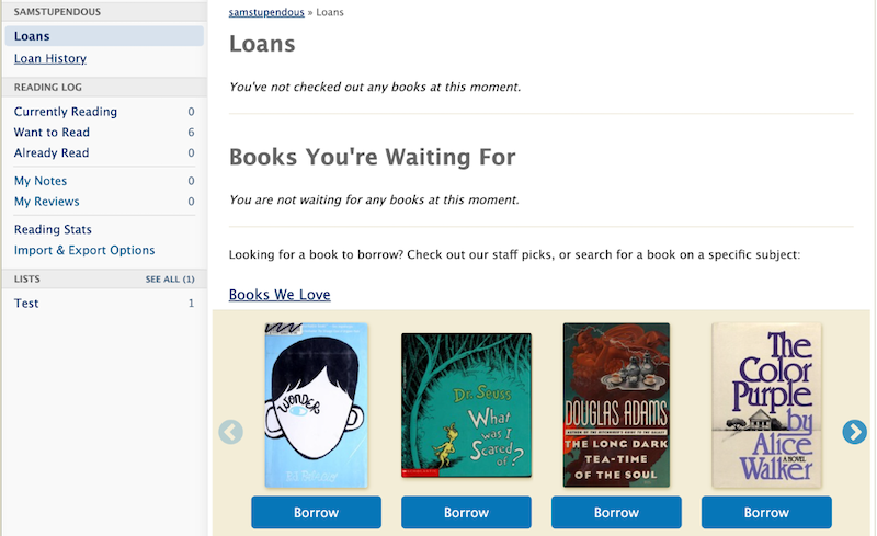
At the beginning of the project the desktop interface loaded by clicking the ‘My Books’ button in the header looked like this:
Another problem that was continually observed with the existing design is the mobile navigation on this page:
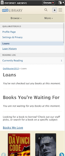
The primary problems observed were related to confusing navigation, particularly on mobile.
The mobile design took the desktop sidebar menu and added it directly below the site header, creating three layers of navigation and a very confusing split in the My Books page interface. This navigation design was neither discoverable nor understandable – many users did not realize the mobile menu of My Books page options is even scrollable, thus losing out on access to over half of the sub-pages (e.g. Want to Read, Already Read, Reading Stats, etc.).
The solution to these glaring design flaws was an iterative approach to overhauling the My Books page, involving numerous Open Library users and stakeholders including UX designers, software engineers, librarians, and readers. Sam served as the lead designer of the new mobile interfaces, as well as the lead front end developer for this project.
APPROACH
After meeting with members of the Open Library team to discuss the main issues, we agreed that the central areas to focus on were:
- Creating an interface unique to My Books that would consolidate a patron’s loans and logs into one page accessed by the My Books button
- Improving the usability of the My Books page on mobile by moving towards a responsive, mobile-first design for the My Books page and redesigning the menu on mobile
The next step was to iterate multiple potential interfaces for the new My Books page on both mobile and desktop. With the help of the Open Library team and other design fellows, we came up with the following options for mobile and desktop My Books interfaces:
In conjunction with Dana, another 2022 Design Fellow, we continued to iterate on the designs based on feedback received from Open Library stakeholders, librarians, and patrons.
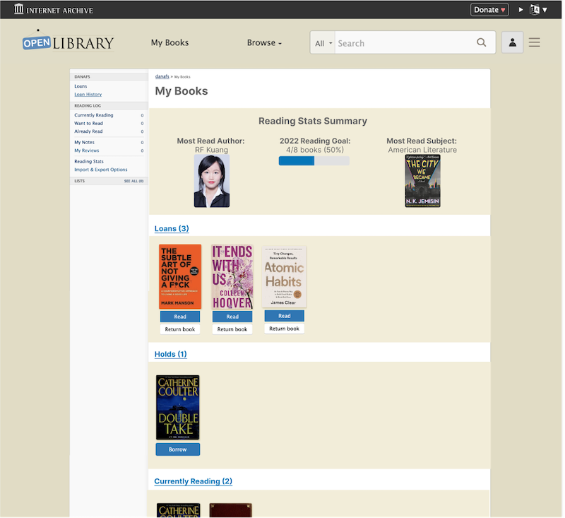
We settled on the following approach for desktop, which includes new carousel sections for displaying books and creates space for a Reading Stats data visualization widget:
Alongside the new desktop design, the mobile-first redesign that we settled on makes use of the existing sidebar menu to guide the structure of the new mobile interface while making use of an information hierarchy already familiar to patrons.
This mobile design not only improves usability and accessibility to the key components of My Books, but also decreases engineering overhead by allowing for a responsive design using the original sidebar menu:
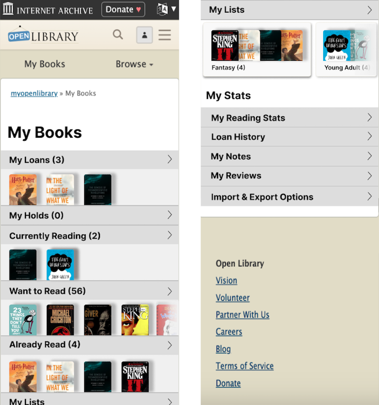
The original My Books sidebar menu has been redesigned to take up the whole landing page, immediately showcasing not only the My Books sub-pages but also previewing the user’s most recently added books for each ‘shelf’ (e.g. Loans, Currently Reading, Want to Read, etc.). By breaking up the menu into a ‘My Books’ and ‘My Stats’ section, the information hierarchy more clearly signifies how the user’s information is organized and how they can find exactly what they are looking for.
ACKNOWLEDGEMENTS
Working on this project with the Open Library community has been an amazing experience in UX design, full stack web development, and community collaboration across state and national lines. I am grateful to be able to contribute to a project that is so meaningful to so many people through its unique ability to disseminate knowledge freely to anyone with Internet access. It was also a fun way to expand my web design and development experience.
I am immensely grateful to the Open Library community as a whole for being so welcoming to me when I joined a few months ago and for continuously supporting my design process through helpful critiques and design input, as well as the general kindness shown in the weekly community meetings. I am especially grateful to Mek, my counter-point on Open Library staff, who has taught me so much about the Internet Archive stack and the Open Library design language, and my main collaborator Dana, who has expertly taken the reins on the Desktop interface designs and navigation for the overall site. I also want to extend my thanks to Drini, Lisa, Jim, Abby, and Hayoon who have all had invaluable contributions to the My Books design and implementation process, as well as the ongoing development of a comprehensive Open Library design system. I’m so excited to continue working with this community and for the completion of the My Books redesign.